Next project_
Information architecture
Information architecture
Improving engagement through app reorganisation
Improving engagement through app reorganisation
Bud is a platform used by global banks to harness the power of open banking and to make life better for their customers. Their initial product offering included a personal finance app designed to improve people's financial wellbeing. This also served as an internal tool to test and develop new technology for Bud's customers.
Bud is a platform used by global banks to harness the power of open banking and to make life better for their customers. Their initial product offering included a personal finance app designed to improve people's financial wellbeing. This also served as an internal tool to test and develop new technology for Bud's customers.
Overview
Overview
As the product scaled and new features were introduced, the user experience inadvertently became increasingly complex. This made it challenging for users to locate key features and navigate the app efficiently. As a result, we observed a noticeable drop-off in in-app engagement. Recognising these challenges, our objective was to rethink and redesign the app’s architecture, and increase the overall in-app user engagement.
As the product scaled and new features were introduced, the user experience inadvertently became increasingly complex. This made it challenging for users to locate key features and navigate the app efficiently. As a result, we observed a noticeable drop-off in in-app engagement. Recognising these challenges, our objective was to rethink and redesign the app’s architecture, and increase the overall in-app user engagement.
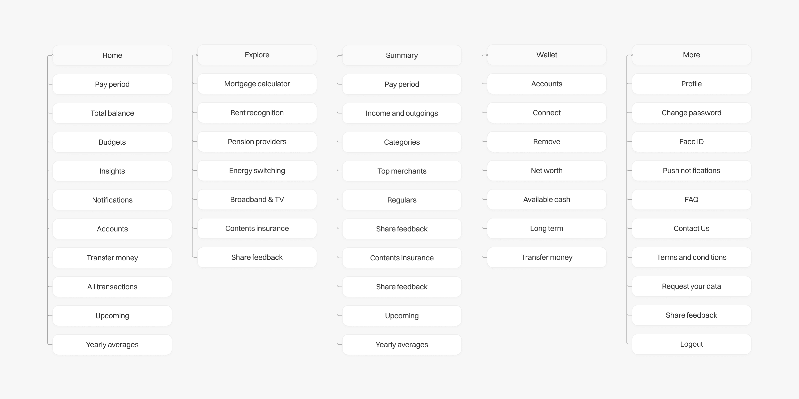


The initial information architecture of the app
The initial information architecture of the app
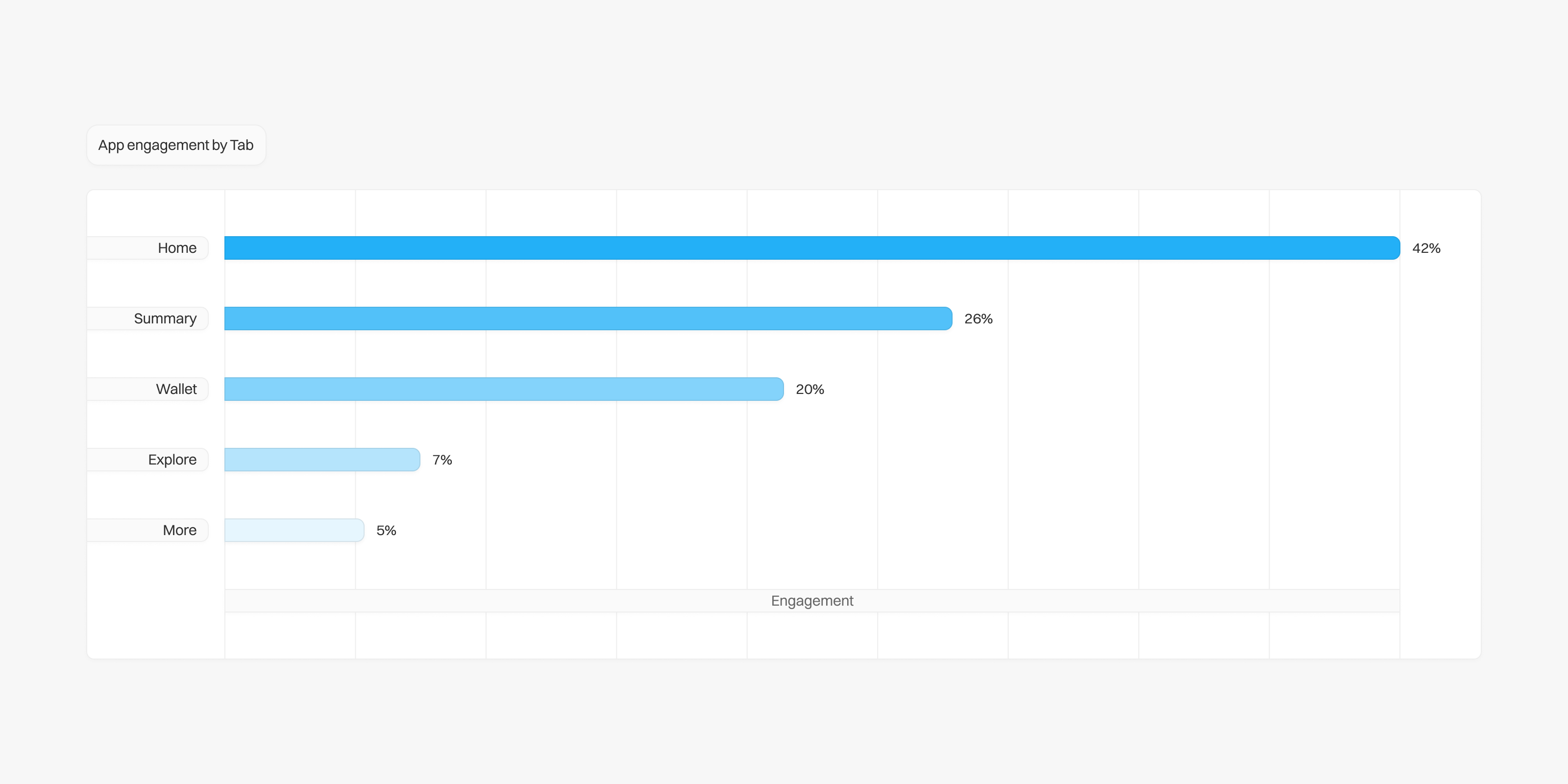


Part of our early analysis involved reviewing existing engagement data
Part of our early analysis involved reviewing existing engagement data
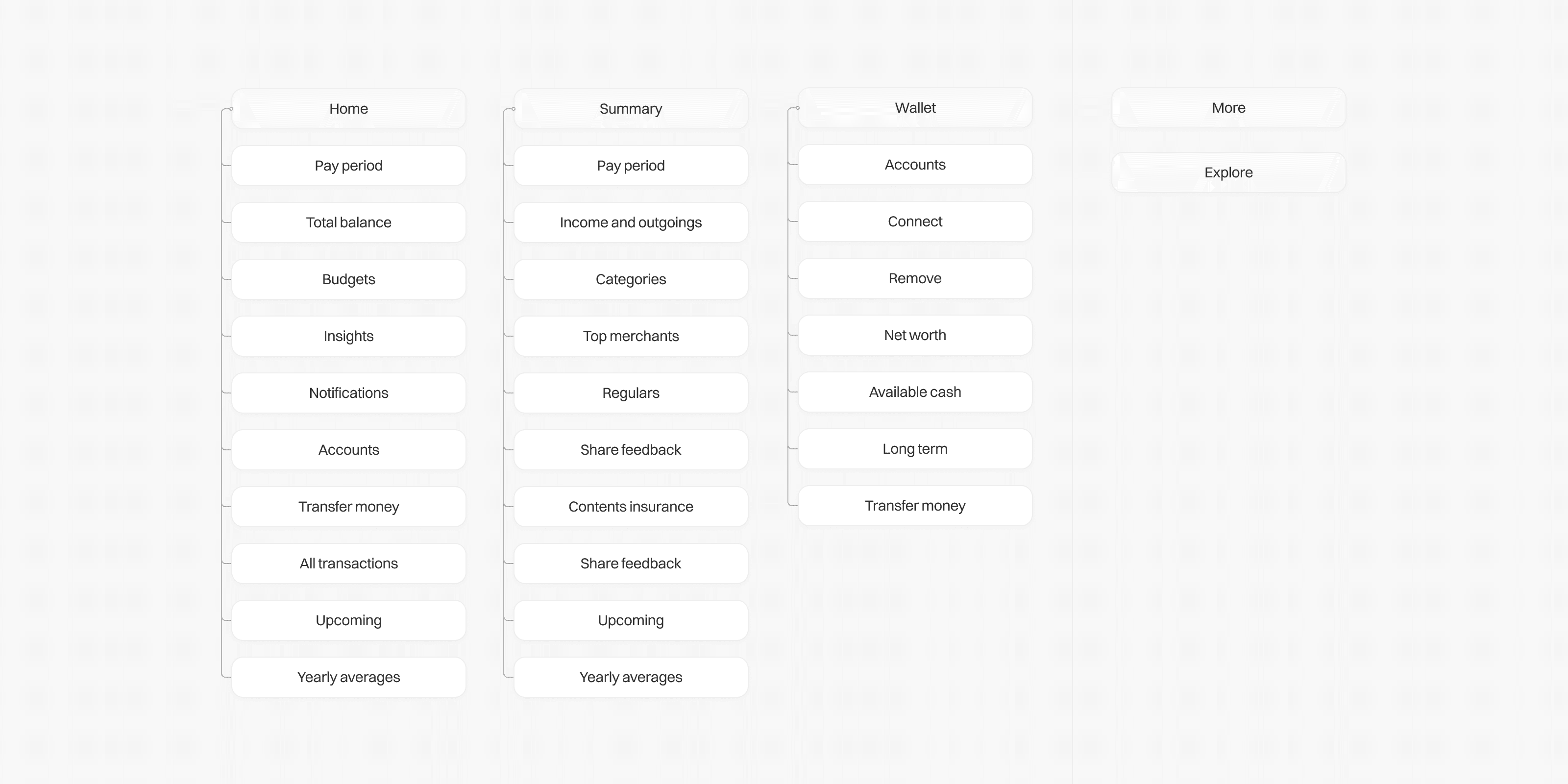


Part of our hypothesis was to remove the More and Explore from the primary layout
Part of our hypothesis was to remove the More and Explore from the primary layout
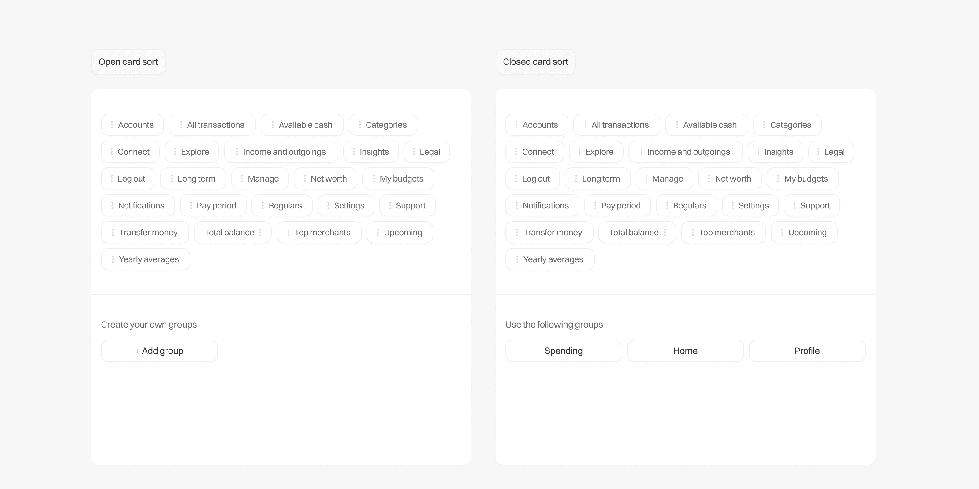


A sample of the two sets of usability testing we ran to analyse our feature groupings
A sample of the two sets of usability testing we ran to analyse our feature groupings
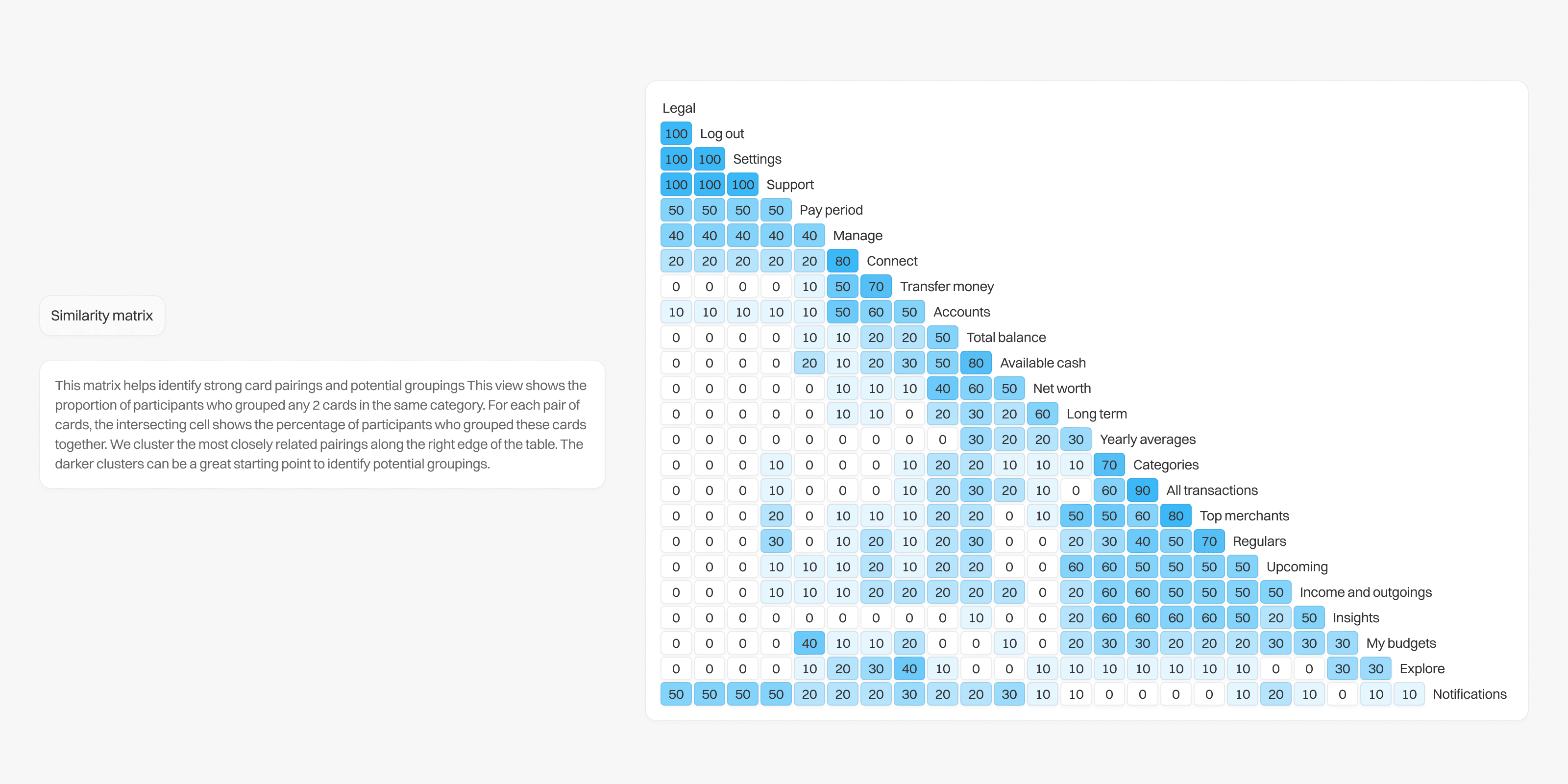


Part of our analysis included utilising a similarity matrix to help identify strong card pairings and potential groupings
Part of our analysis included utilising a similarity matrix to help identify strong card pairings and potential groupings
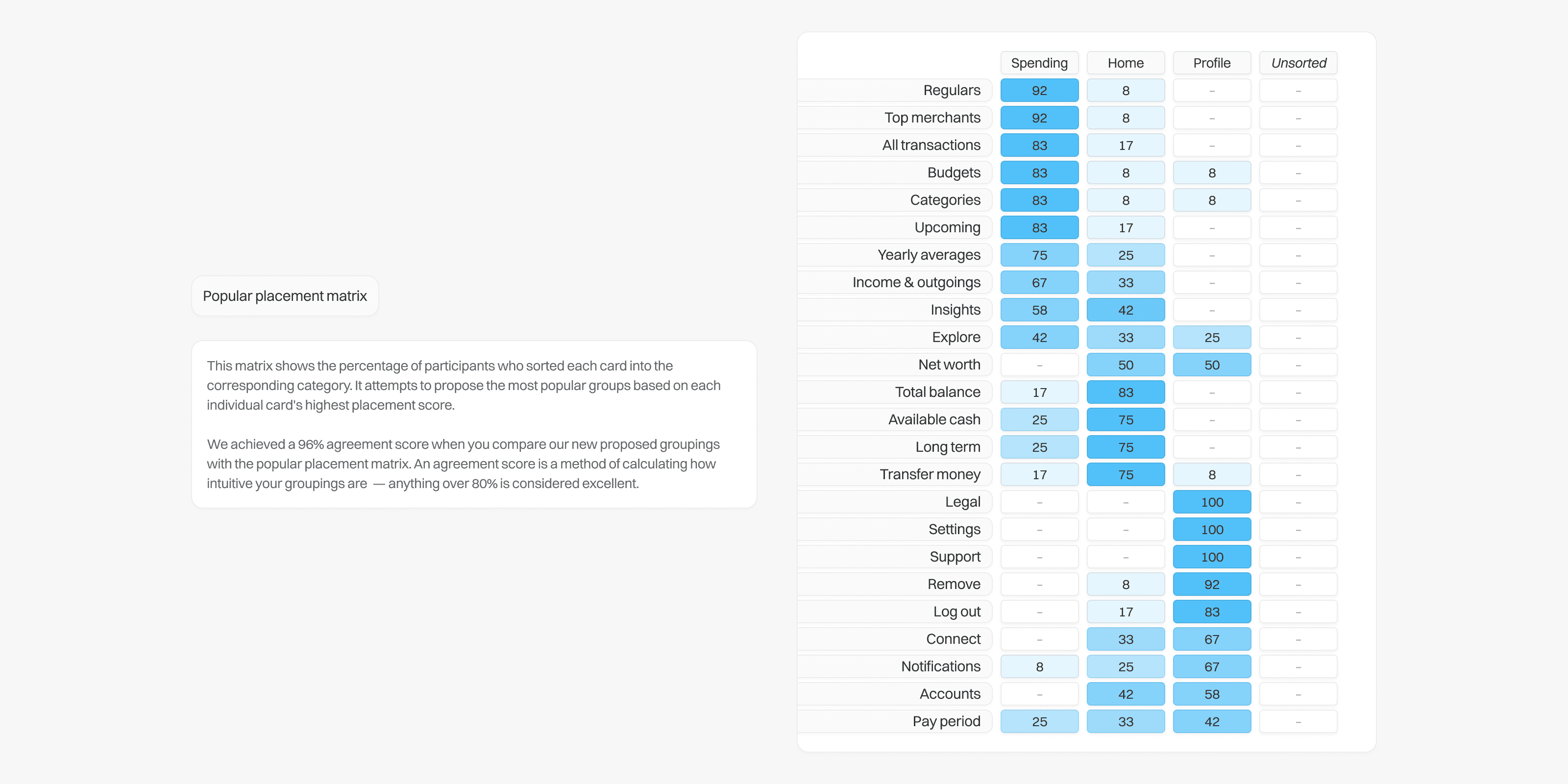


We also utilised a popular placement matrix to understand the collective view of the all our participants
We also utilised a popular placement matrix to understand the collective view of the all our participants
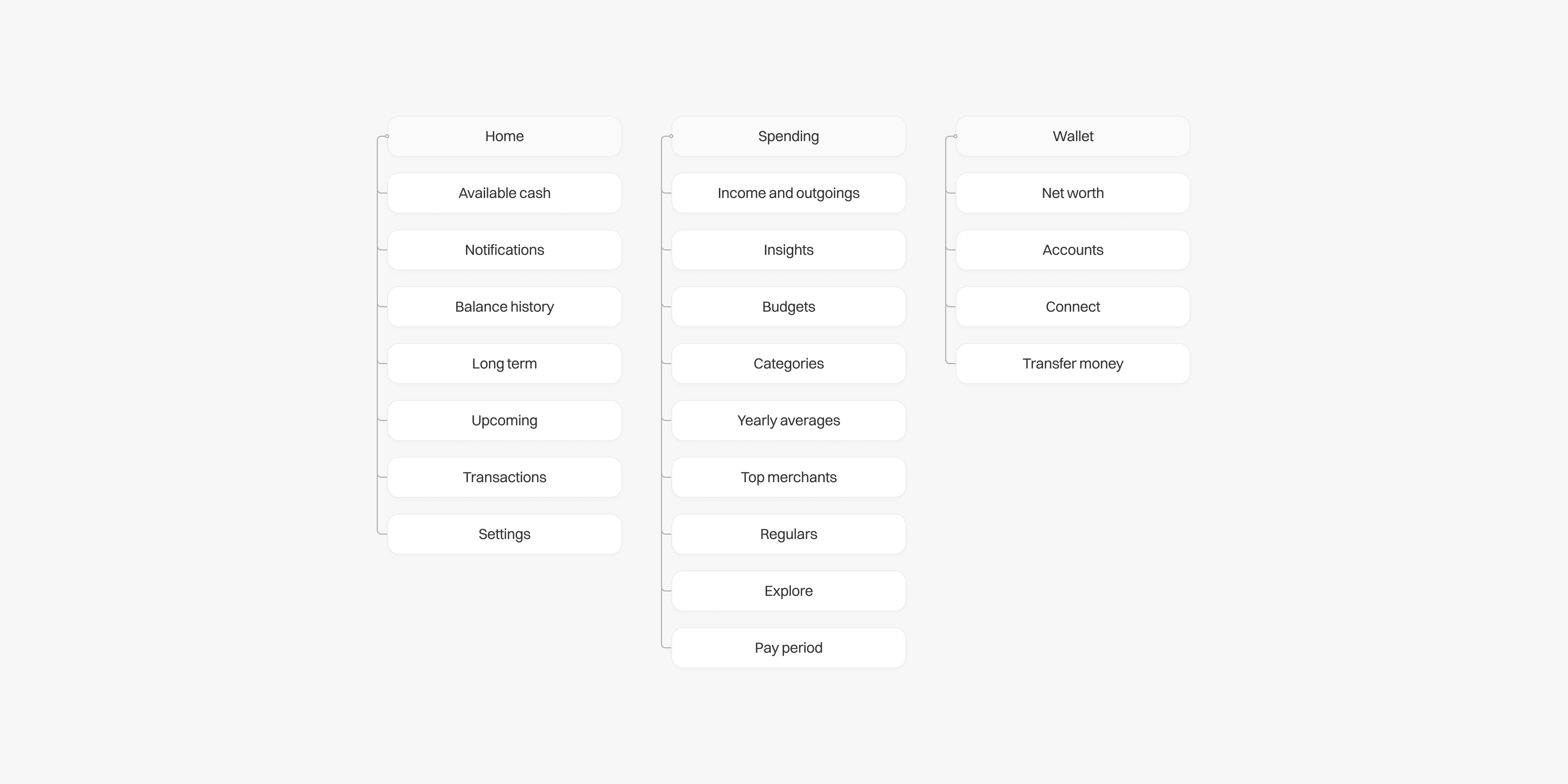


The final version of the new information architecture
The final version of the new information architecture
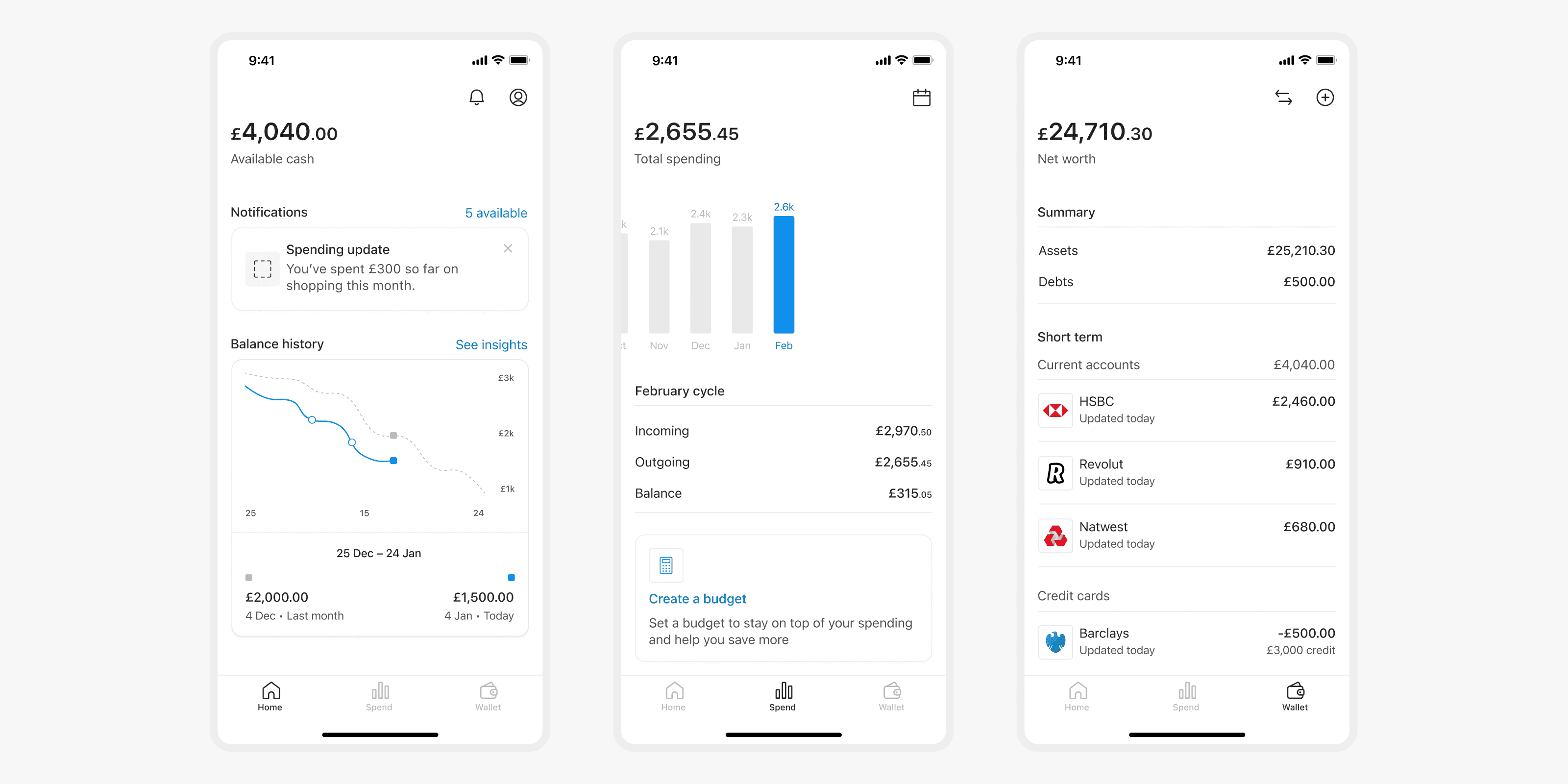


A preview of how this looked for users in the app
A preview of how this looked for users in the app
Outcome
Outcome
The research culminated in the implementation of a streamlined three-tab navigation system, with features logically organised based on over 20 hours of customer research. By the end of the following quarter, this redesign led to a notable increase in in-app engagement. Daily active users increased by 12%, session lengths rose from 3 to 4 minutes, and the weekly retention rate improved by an additional 10%. Moreover, the app was now better positioned for growth, with an information architecture designed to facilitate the introduction of new features in the future.
The research culminated in the implementation of a streamlined three-tab navigation system, with features logically organised based on over 20 hours of customer research. By the end of the following quarter, this redesign led to a notable increase in in-app engagement. Daily active users increased by 12%, session lengths rose from 3 to 4 minutes, and the weekly retention rate improved by an additional 10%. Moreover, the app was now better positioned for growth, with an information architecture designed to facilitate the introduction of new features in the future.